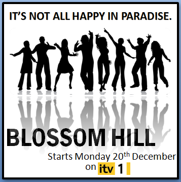
Like for my plans for a magazine cover I also had to do the same with the poster so I have created two plans which were both done on the computer.
The first poster plan is very simple, I wanted everything to be black and white apart from the picture so it would stand out more as the picture is the main focus. My tag line "It's not all happy in paradise" stands out very well as it is big and bold at the top of the poster. The text is also very clear for the name of our soap "Blossom Hill", and I have also included when it starts and what channel so all the information needed is on there. I like the idea as it's set out very clear but then I do think it is a bit boring.
For the second poster plan I also did an improved version, I really like this idea because it's not boring like the first plan. The tag line has a slight change "It's not all perfect in paradise" because I think the use of the "P's" sounded better. The poster is a contrast because on one half the background is a peaceful beautiful beach that looks like heaven where as next to it the background is a very harsh thunder and lighting which is very negative compared to the first picture but this ties in with the tag line of "not every things perfect in paradise" which I think goes really well. Again there is a picture of the cast in the centre of the poster which half with be in the positive side and half in the negative. All the information needed is on the poster set out nice and clearly, this idea is my favourite one as it is so much better than my first plan because it's fun, interesting and has a meaning.


